


Momotari is a playful toy retail concept built around collectible culture and LEGO reviews. Starting with no visual foundation, I developed a complete brand identity system—from early sketches to final deployment—designed to scale across digital, print, and merchandise.
Client:
Independent Toy Retail Concept
My Role:
Brand Strategy, Visual Identity Design, Logo Development, Packaging Design, Motion Concepts
Year:
2024
Tools:
Illustrator, Photoshop, After Effects
Create a flexible, memorable brand system that appeals to kids, collectors, and casual fans while remaining adaptable across platforms.
The homepage gives a clear snapshot of upcoming events, key forms, and quick-access resources. Everything important is surfaced in one glance, removing the need to dig through chats, emails, or old folders.

Primary logo applied to shopping bag with bold color blocking for strong in-store visibility.


A modular pattern derived from the logo mark, designed for scalable packaging and background use.
Consistent application across print materials, ensuring cohesion across touchpoints.

Alternative logo variation designed for merchandise and small-format applications.
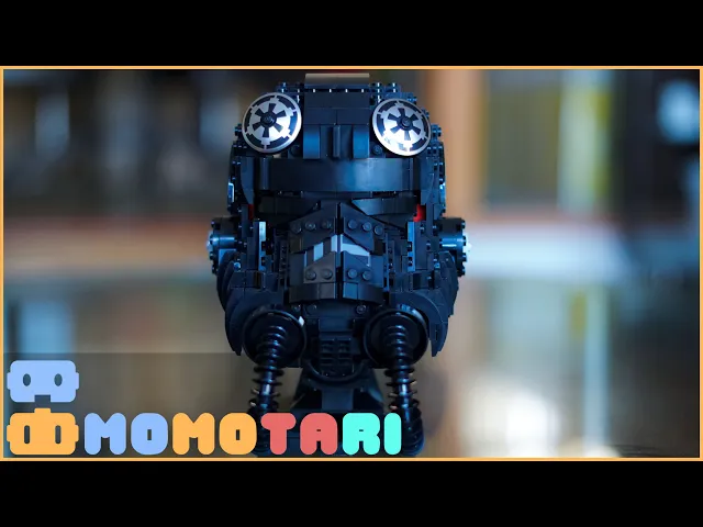
Logo adapted for YouTube branding and digital content to support online growth.
Exploration began with rapid sketching—robot faces, block shapes, and mascot-like forms. These early concepts informed a final mark that feels modular and expressive.

#5FFFF0
#E66A6A
#FFB958
#8FBFFF
A high-energy palette drawn from classic toy branding.
Vibrant primaries drive excitement, while black provides structure and contrast.


Jellies for headlines introduces personality and play.
Inter supports with clarity and digital legibility.
Together, they balance character and usability.

A consolidated one-page identity guide created for client implementation, outlining logo usage, typography, color system, and application standards.
